
Happy Caturday, Patreon Fam! This week’s cat photo is Admiral Coco Marshmallow Flerkin-Whittingstall enjoying a little sunshine. One of the few shots I’ve got of her sleeping of late, and one of the rare interactions we’ve had this week where she hasn’t tried to bite me in a bid for attention.
Spent more time than is healthy on Threads this week, having realised it’s less a Twitter replacement and more low-key blogging platform with a mildly irritating interface. Spent a goodly chunk of the week firing off threads about writing and publishing, much as I used to when I blogged regularly, and it’s been interesting to see things get the kind of response they used to circa 2012. It won’t last, but it’s been fun.
I also revised my newsletter system, which I’ve been threatening to do since 2019, only to constantly the job put aside in favour of giving more focus to Brain Jar’s systems instead of promoting my own books. No regrets, but leaving it this long turned it into a bigger job than initially thought—virtually everything about the old newsletter rolled out worked best in a pre-pandemic, pre-publishing other people world.
So I’ve been rebuilding from the ground up, and thinking through pathways in which I’d like to introduce folks to my books. This resulted in an interesting little publishing insight that I’m tucking down at the end of this post.
The Venn diagram of people who follow this Patreon and subscribe to my newsletter are almost, but not quite, a circle, so if you’d like to download the free subscriber library you can get the books here: https://books.bookfunnel.com/pmbstarterlibrary
WARHOL SLEEPING
The sole project that’s running on track this week. Structurally, the first chapter of the second act is always one of my favourites—you get to kick off the subplot and typically introduce new story elements that further disrupt the status quo of the first act.
A chunk of the folks who found me on Threads came over to read the free entries in this series, and one of them mentioned a Gibson meets Kerouac vibe through the first four chapters. Startling moment, as I would have been deeply immersed in Kerouac’s work when I wrote the first draft of these stories and he was undoubtably an enormous influence on where I was going with the poet-writing-prose aspects. Twenty years wore away that memory, though, and it wasn’t until someone pointed it out that it all came rushing back.
Interesting thoughts to have in my head as I work on next week’s chapter 6.
THE SHACKLETON JOB
An inauspicious start given that I lasted one week before blowing my regular posting day. I usually have two days set aside for the serials – Tuesday and Wednesday – where I do the bulk of my writing and cleaning up of chapters before they go live. I specifically avoid taking coaching or mentorship calls those days, but this week, one of my clients contacted me in need of urgent help. They’ve got a book coming out in February, and the printer isn’t playing well with their cover designer’s work.
This triggered four days of trying to find a solution and hosting emergency catch-ups instead of writing and editing. Most of it has just been a reminder that I’m really glad I learned the basics of book design for my work and Brain Jar’s releases—when things go wrong, it’s way easier to fix one’s own mistakes than take wild guesses at what’s going on at a designer’s end and try to negotiate a fix.
My main goal for the coming weeks is to get ahead of this serial, so I’ve got. bit of a buffer when unexpectedly complicated weeks crop up.
OTHER WORK
Lots of publishing work on my end this week, including getting Joanne Anderton’s The Bone Chime Song and Other Stories to the printers and reworking all the promo graphics because we’d made a few tweaks to the covers.
BEHIND THE SCENES: COVER DESIGN & FONT CHOICE
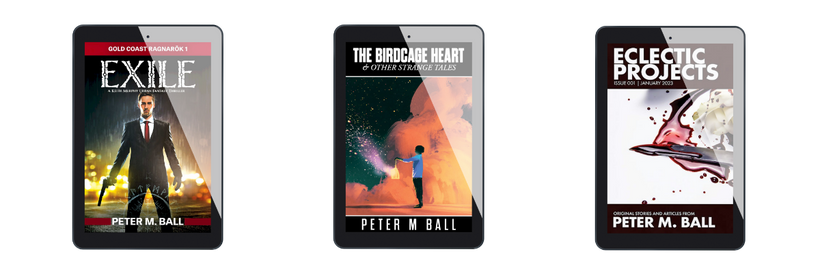
Earlier in the week I’d done a short Threads essay on doing cover design on a budget, leveraging the lessons from Penguin to keep costs down on your early books (See the thread here). Ergo, issues of continuity and design were top of my mind as I reworked my newsletter offering and pulled together a new starter library to introduce people to my work. It really came to a head at the final moment, when I uploaded the starter library graphic and thought “Hmmm. That middle book’s showing its age”.

Most folks aren’t going to notice it, I suspect, but The Birdcage Heart is one of my earlier designs from prior to 2020. It’s a solid enough cover, but at the time I used a lot of Gothic fonts in my designs, and I now use a lot of Futura-based fonts for my own work as a default. it’s the font that appears on the core design of the Eclectic Projects magazine, and the secondary font on the Exile cover, used for the author name and the series branding at the top.
It took me about three hours to get so irritated at The Birdcage Heart standing out from the other two that I decided to give it a make-over. The results are below.

I’ll note – I didn’t hate the old cover. It just looked like a Brian Jar Press book (where I still use gothic fonts a lot) and I’ve spent the last three years adding some distance between my work and Brain Jar. Plus, when presenting three books as a starter library, tt makes a small-but-startling difference to have the same fonts on all three books. I’ve also intentionally pulled the layout of the Eclectic Projects cover over and repeated the placement and font sizes in The Birdcage Heart. Subconsciously, the three books look like they belong together, rather than having the short story collection as the odd man out.
I spend so much time talking folks I’m coaching through the cover process, and a huge part of that conversation is “spend less on the art, spend more time picking your repeating elements.”
It’s nice to put my money where my mouth is in this instance.
And again, while you can sign-up for my newsletter to get these, I’m perfectly happy for Patreon folks to go grab them directly: https://books.bookfunnel.com/pmbstarterlibrary